Tuesday, 8 February 2011
Old Ancillary Products
Here are my old ancillary products, i have only got to make a few slight ajustments after this stage.


Monday, 7 February 2011
Improving my Film Magazine
Audience Feedback on Second Draft of Ancillary Products
For my Second peice of ancillary feeback for i am going to be getting feedback via a questionnaire:
Question 1:
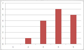
Question 2:

Question 4:

Question 5:

With questions 3 i asked people who took part in the questionnaire to give their views and opinions for my film magazine front cover.
Here are some of the comments:
"Try using the real "Empire" logo from an actual Empire film magazine from the internet."
"Where you have put the "puff" you can't really see what it says inside it, try moving it to the right hand side a little way up from the barcode and slightly down from the film poster."
"The barcode is very unrealistic, the only thing i can suggest to make it look more realistic is to scan a real varcode from a magazine you already have."
With question 6 i also asked people who took part in my questionnaire to give their views and opinions for my film poster.
Here are some of the comments:
"To make your film poster of "Runaway" look like a film poster you would see on the current film market, you shouldchange the text of the bottom ("Starring the award winning Sean Beddows. Directed and produced by Richard Beddows")so it is on one line with the text much smaller."
"To make the film poster look similar to other film poster you really need to put a viewing certificate on the poster (make it look offical though)."
"To make better use of the rather empty space in the middle you could move the film's tag line to the more spacious part of the film poster, as it looks rather crampt at the top of the film poter."
Create your free online surveys with SurveyMonkey, the world's leading questionnaire tool.
Question 1:

Question 2:

Question 4:

Question 5:

With questions 3 i asked people who took part in the questionnaire to give their views and opinions for my film magazine front cover.
Here are some of the comments:
"Try using the real "Empire" logo from an actual Empire film magazine from the internet."
"Where you have put the "puff" you can't really see what it says inside it, try moving it to the right hand side a little way up from the barcode and slightly down from the film poster."
"The barcode is very unrealistic, the only thing i can suggest to make it look more realistic is to scan a real varcode from a magazine you already have."
With question 6 i also asked people who took part in my questionnaire to give their views and opinions for my film poster.
Here are some of the comments:
"To make your film poster of "Runaway" look like a film poster you would see on the current film market, you shouldchange the text of the bottom ("Starring the award winning Sean Beddows. Directed and produced by Richard Beddows")so it is on one line with the text much smaller."
"To make the film poster look similar to other film poster you really need to put a viewing certificate on the poster (make it look offical though)."
"To make better use of the rather empty space in the middle you could move the film's tag line to the more spacious part of the film poster, as it looks rather crampt at the top of the film poter."
Friday, 4 February 2011
Thursday, 3 February 2011
Wednesday, 2 February 2011
Using Paint.Net for my Film Poster
I uploaded my newly edited photo to Paint.Net.

I then looking through the font types, taking into account the feedback i was given from my first draft i decided to use a less formal font, so i used Verdana.

I then added my name above the film title Runaway, the reason why i did this is because most film poster sadd the director's and producer's name on the poster.

I then added the tag line for my which is "A Woman's search to find her son...a son's search to find his freedom". I also added the line "Starring the award winnng Sean Beddows. Directed and produced by Richard Beddows".

Tuesday, 1 February 2011
Using Paint.Net for my Magazine Front Cover
I have decided that for to improve my film magazine front cover using my feedback i am going to do this with Psint.Net. The reason why i have decided to use Paint.Net for my film magazine front cover is because you can completely tranform the image and it makes it look more effective.

Once i opened Paint.Net i then imported my film magazine front cover to Paint.Net so i could make the improvments needed.

When i opened my film magazine front cover i could then started editing it from my audience feedback.

Once i had uploaded the image to Paint.Net because i didn't have a great deal of experience with using the software i had a little play around with it to get familiar with the process.
When I opened the transparencey is was only on 0 so i decided to boost this up to 100because it makes the image more bold and also shows more detail of the image.

I then changed the colour balance to ensure that the red had more dominance in the magazine front cover. Although you will not see much red in the final magazine front cover i need to make the red more domiant to make sure that the tone of colour is exactly right.

I then used curves to make the more bolder effect that i was going for more effective.

After i made the image bolder i then auto leveled the image to make it have more of a black and white effect to it.

Without the text this is what my final magazine poster will look like.

Once i opened Paint.Net i then imported my film magazine front cover to Paint.Net so i could make the improvments needed.

When i opened my film magazine front cover i could then started editing it from my audience feedback.
Once i had uploaded the image to Paint.Net because i didn't have a great deal of experience with using the software i had a little play around with it to get familiar with the process.
When I opened the transparencey is was only on 0 so i decided to boost this up to 100because it makes the image more bold and also shows more detail of the image.
I then changed the colour balance to ensure that the red had more dominance in the magazine front cover. Although you will not see much red in the final magazine front cover i need to make the red more domiant to make sure that the tone of colour is exactly right.
I then used curves to make the more bolder effect that i was going for more effective.

After i made the image bolder i then auto leveled the image to make it have more of a black and white effect to it.

Without the text this is what my final magazine poster will look like.

Subscribe to:
Posts (Atom)