Film Trailer
The first thing to notice when watching this film trailer is the music that is constantly played in the background. The music that is been played sound like it is leading up to a big event. As the action starts to take place in the trailer the music in the background starts to build up and the sound begins to be very much in the foreground. Half way through the trailer the shots changes from a war zone to a hospital, with this change in the shot the music also changes. The souns to changes to a heartbeat sound. This may give the audience the impression that the people in these particular shots maybe fighting for their lives.
The editing in this trailer is very fitting to the music played. The shots are edited mainly by using a fade to black and then to the nexy shot. Each time this happens the music stops to build up the tension.
Film Poster 
When the audience see this film poster the first thing that will stand out is the use of colour. The poster is largly black and white, however there is a little red in the film poster. The red in the film poster gives the audience the impression death, blood and danger. All these things and connoted with red are in some related to the film, the reason for this is because the film is about the war in Nazi Germany.
The film poster is very simplistic, however it is very effective. The title is in large black text agaist a white background so this will stand out to the audience. The other thing that will stand out to the audience is the main actor who is in the film name; Tom Cruise. The reason why Tom Cruise's name stands out is because it is in white, but the background is red.
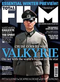
Film Magazine
 The title of the film in this film magazine stands out to the audeince because it is bright blue. Also in the centre of this film magazine is a soilder, and this is what this film is about, so the audience will see this the minuet they look at this magazine front cover.
There is also other advertising on this magazine front cover for what is inside the magazine, however it does not take the audience's attention away from the film on the front cover.
Apart from the bright blue title the rest of the colours that are used ion this magazine front cover are very dull. The reason why the colours are very dull is because the film is about war, so you get the impression it is a very serious film. If the colours were bright yellows and oranges then you would get the impression that the film would be very happy a cheery.


.jpg)


