Wednesday, 22 September 2010

Film Poster (Sin City)

This is the film poster for the film Sin City.

The first thing the the audience see is the women in the poster, Jessica Alba. The women is dressed provocatively, this is already indentifying the film for a male audience.

In this film poster because of the way that the women standing and what she is wearing, she is only seen as a sex object. This film poster does generalise women as sex objects and nothing else.

In the second text box it says "Jessica Alba in Nancy", rather that what most posters would say " Jessica Alba as Nancy. This give sthe impression that the actress is not playing the charcter, but living the character. This may also emply that the role of Nancy was made for her.

The title of the film "Sin City" is in red. Red can suggest; Death, danger, love and lust. This suggests that the film will be about all of those things, the photo of the women reinforces this.

Monday, 20 September 2010

Film Magazine Analysis (The Dark Knight)

This is the film magazine Empire promoting the film The Darak Knight.

The main thing that draws the audience's attention to this magazine front cover is the colour. The colours used are green and pink. These colours represent a joker/clown effect. Also the puff is also green which draws the audience's attention because the Joker is also in green.

The name of the magazine; Empire is in the backgroud of the main subject which is the photo of the joker. The reason why the magazine title is not at the subject of the front cover is becauase name is already established, and also the audience has also been established, unlike with the very first edition of the Empire magazine that was published in july 1989, as shown below.


With this magazine front cover the main thing that stands out to the audience is the title. The reason why the makers want the title to stand out is because the magazine is new and they want to establish the magazine.

Thursday, 16 September 2010

Film Magazine Analysis (The Hulk)


This is a film magazine, promoting the film, The Hulk.
The first thing that the reader will see is the image because is dominates the cover, there is not alot of other information of this cover, so the maker will hope that the protential reader will buy the magazibe because they are drawn into the magazine because they want to watch the film. The only other information that is printed is a small puff, the titles of the magazine and film and the word unleashed.
The word unleashed is in bold capital letters ending in a exclamation mark. The reason why the word is set out like this is because it is connected to the imagine, the person in the image (the hulk) is being unleashed.
The colour used are very simple colours, to attract readers. The main colour that is used on the image is green, the reason for this is because the character in the poster (the hulk) is green and the title is also partly green. The puff that is also on the cover is green, to get the readers attention. The reason why the puff is important is because the content says; " INCREDIBLE! THE WORLD'S FIRST FULLY 3-D COVER!", this is important because its a big step in the film magazine history.

Monday, 13 September 2010

My film Genre

There are many genres that I can choose from, every single film out there has a genre to it. Most film genres are easily identifiable, for example a comedy film that just from looking at it you know its a comedy film is Evan Almighty.

Evan Almighty is obviously a comedy film by just looking at the film poster;

There are many things what make this film poster a comedy film poster.

The first thing that makes this film poster a comedy film poster is the fact that the tropical animals are animated. It makes it look like you are viewing a poster for a cartoon series, Similar to Bugs Bunny.

The second thing that makes thing film poster a comedy film poster is the colours used. The colours are used are bright and cheerful, this will put the viewer in a cheerful mood, so they will know its a comedy film.


This is a film poster for a horror film. You can tell this is a horror film just by looking at the film poster.

The first thing that makes this horror film is the first thing that the viewer will see which is the head with no eyes or month, this could give viewers a fright because it is abnormal.

The second thing that makes this film poster a horror film poster is the colour that is used . The whole poster is made up of dark dim colours, there is a little bit of red in the poster, but this colour doesn't insinuates joy and happiness, it insinuates sorrow and blood, so the viewer may get the idea that a death will occur.


Altogether with the film poster, magazine front cover and a teaser trailer, i need to decide what genre i decide to use. Having looked a few genres and making the opening to a thriller film for my AS coursework i have decided to use a horror genre.

The reason why i have decided to use a horror/thriller genre is for two reasons. The first reason is that because i used a thriller genre for my AS coursework, i wanted to do something that would be similar but not the same, and a horror film is just that. The second thing is actors, its easier for non professional actors to act in horror trailers, because horror teaser trailers will be more simpler than say a romantic comedy teaser trailer.

Although i did use a triller grenre for my AS coursework i could still use it for my A2 coursework because there is alot to play with in a triller genre.

Friday, 10 September 2010

Film Poster (Fright Night)


This is a film poster for the film Fright Night.
The makers of this film poster have used dim colours, the reason for this is because the title of the film "Fright Night" is ment to sound scary, and the poster echos this.
There is a ghost like figure over the house, this will give the viewer the impression that the house may be haunted.
The house is also very isolated, which gives it a sence of vulerability.

Friday, 2 July 2010

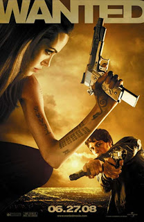
Film Poster (Wanted)


This is a film poster for the 2008 film Wanted. Wanted is directed by Timur Bekmambetov.
This makers of this film poster have only used simple colours, the reason for this is because if there are too many bright colours the viewer will become confused.
This film poster is very catchy because your attention is automatically drawn to the woman in the foreground of the poster. The woman is shown very un-stereotypical in this poster because she is holding a gun.
This film poster also suggests a storyline. The name of the film is Wanted and because the man is pointing the gun at the woman it suggests that the women in the film poster may be wanted.

Thursday, 1 July 2010

Film Poster (Jaws)


This is a film poster for the classic film Jaws.
This film poster is very simple but very effective.
The film poster tells the story of the film in just one page. Basically the story of Jaws is that a shark appearing in the sea and eats people.
The poster leaves a cliff hanger to the viewer because you can see a person swimming at the surface of the water and the viewer will be thinking, will the shark kill the man?
The title of the film Jaws in in a bright red colour, which is the same colour as blood. This gives the viewer the impression that blood will be involved in the film.