
Tuesday, 21 December 2010
Thursday, 16 December 2010

Wednesday, 15 December 2010
Name's for Magazine Front Cover
For my film magazine front cover i have two options in terms of names. My first option is to use a well know magazine name such as Empire or Total Film. My second option is to use a less well known film magazine name such as Electric Sheep.
Using well known film magazines names has the advantage that you can can have images part the way over the film name because the film magazine is well known, so their audience is already established.
If you use the less well film magazines then although you have the adavantage of pulling in new audiences, it is best that you leave the film magazine title name free from images because you want new people to buy the magazine and if the title is left free than more people are likely to buy it.
Upon considering both options for my magazine front cover page i think it is best for me to use a well known film magazine for my film magazine front cover ancillary product. The reason for this is because i want to be able to use images that can stretch over the title to make full use of the magazine front cover.
Tuesday, 14 December 2010
Ancillarys
When i produce my film poster and a magazine front cover. Before i create my poster and magazine front i need to consider if i am going to use an image (a still shot)from my teaser trailer, or if i am going to use new images. Because of photo quality i decided to use new images that had not be included in my teaser trailer.
For my teaser film poster i am going to use a photograph of the child running away. This will be hard to create because i must ensure that the quality is of a high standard because i want it to look professional. For my magazine front cover i am going to use a still shot taken with a proffesional photographers camera this will make the photo look more effective, and the detail will be better.
There are some things for both the magazine front cover and the teaser film poster that i will have to ensure that i keep the same, these include:
- The font and colour of the film
- The same sort of colours for the image (it wouldn't work if the film poster is a a light colour and the magazine front cover is a dark colour).
Tuesday, 7 December 2010
Final Teaser Trailer
Here is my new teaser trailer with the improvements made - which people wrote in a comment on youtube to suggest some changes to make it look better:
Monday, 6 December 2010

Friday, 3 December 2010
How to improve my teaser trailer from my first draft
Once i uploaded my film to www.youtube.com i was able to see comments that people i emailed to reply. I emailed people on my contact list to ask them to give me their views and opinions. This is helpful to me because people are able to compare my teaser trailer to other trailers they have seen in the past, so therefore it will make it look a litte more mainstream with their advise.
One of the comments on the teaser trailer on youtube was:
The titles on the video look ineffective espically with the white
The people names could be effectively used by placing them over the persons face
At the end when the mobile phone is shown the quality could be improved by changing the ending to a louder ending, similarily to the build up of tensions in an argument if you get what i mean?
(To see the comment on www.youtube.com visit this link; http://www.youtube.com/watch?v=4jGPX65xd1 ).
Wednesday, 1 December 2010
Poster Research
One of the best film posters that i have research is the film poster for Vera Drake.
Mike Leigh is known for writting drama films, other drama films that he has written are; Secrets & Lies and Naked. These films focus on real-life, everyday situations. Vera Drake is a drama film that is produced by Simon Channing-Williams and it is directed by Mike Leigh
The film posters for Mike Leigh's films are of the main character(s) in in film. This is the film poster for Vera Drake:

This film poster has used dark colours for this poster and it uses a red colour for the title of the film. Using the colour red suggests to the audiences that their is death involved within the, and because the red text is the title and the title is that womens name; Vera Drake it gives the audience an idea that it might be Vera that kills somebody.
The photo of Vera Drake is a very innosent picture, this makes the audience automatically feel sorry for Vera - without even seeing the film, not even knowing if she is guilty or inocent.
Wednesday, 24 November 2010
Monday, 15 November 2010
Titles for my teaser trailer
For the titles for my teaser trailer i have decided to use simple but effective titles.
For the first draft of my teaser trailer i am going to put the titles on a plain white background, with the colour of the text being black.
If i recieve feedback about the titles i will change it to how other people who aspct them to look.
For the first draft of my teaser trailer i am going to put the titles on a plain white background, with the colour of the text being black.
If i recieve feedback about the titles i will change it to how other people who aspct them to look.
Friday, 12 November 2010
Edit List
Edit 1: Fade
Edit 2: Fade
Edit 3: Fade
Edit 4: Fade
Edit 5: Fade
Edit 6: Straight cut
Edit 7: Straight cut
Edit 8: Straight cut
Edit 9: Fade
Edit 10: Fade
Edit 11: Fade
Edit 12: Fade
Edit 13: Straight cut
Edit 14: Straight cit
Edit 15: Straight cut
Edit 16: Straight cut
Edit 17: Straight cut
Edit 18: Straight cut
Edit 19: Straight cut
Edit 20: Straight cut
Edit 21: Straight cut
Edit 22: Straight cut
Edit 23: Straight cut
Edit 24: Straight cut
Edit 25: Straight cut
Edit 26: Straight cut
Wednesday, 10 November 2010
How to get sound for my film
I can't use any old sound that i find on the internet for my film because it has to not have a copyright law on it.
A website that does not have any copyright laws on is www.freesound.org.
The first thing that i had to do when i went onto the freesound website is create an account so i would be able to download sounds.
Once i made my account and logged in i can then start to download any sounds from the website that i want.
Tuesday, 9 November 2010
Final Script
Mom: Where the hell have you been?
Mom: What time do you call this? Half past 3 in the morning and you are 16 years old. Have you got any idea how much worry you have caused me and your dad? Have you?.
Mom: You are so selfish, i've got work in the morning. How am i supposed to get to sleep know you're out god knows where.
Mom: Have you been drinking?
Son: No, God
Mom: You have. You have been drinking, i can smell it, i can smell drink on you.
Son: So what if i have, i'm 16 i can do what i want.
Son: Just get out my life.
Monday, 8 November 2010
Shot List
Shot 1: This is the shot of when the son is walking into the via the back door and reaching for the light switch.
Shot 2: This is the shot where the mother is revealed from the son turning on the light. Dialogue used is by the mother asking her son "where the hell have you been?".
Shot 3: This is the shot where the son is running through an islocated path.
Shot 4: This is the shot that is similar to shot 2 where the mother is in dialogue to her son "What time do you call this, half past 3 in the morning and you are 16 year old. Have you go any idea how much worry you have caused me and your dad? Have you?".
Shot 5: This shot is similar to shot 3 where the son is running through an isloated path, however in this shot the son is continuely running towards the camera.
Shot 6: This shot is similar to shot 2 and 4. Dialogue is used in this shot. The mother says to her son "You are so selfish, i've got work in the morning. How am i supposed to get to sleep know you're out god knows where. Have you been drinking?".
Shot 7: This is the shot where the son replies to his mothers question "No, god".
Shot 8: This is the shot there is camera is over the shoulder of the son with the mother saying "You have been drinking, i can smell it. I can smell drink on you"
Shot 9: This is the shot where the camera is now over the shoulder of the mother and the son replies "So what if i have i'm 16 i can do what i want, Just get out my life"
Shot 10: This is the shot that is similar to shot 3 and 5 where the son is running through an isolated path. However in this shot he runs past the camera.
Shot 11: This is the shot where the mother puts her hands over her face and moves towards the door.
Shot 12: This is a shot of the son running up the stais.
Shot 13: This is a shot of the mother opening the kitchen door and walking through it.
Shot 14: This is a shot of the mother walking on the other side of the door towards to stairs.
Shot 15: This is the shot where the son is in his bedroom packing some of his belongings into his bag.
Shot 16: This is a shot to show the next day.
Shot 17: This is a shot of the son walking acroos the landing and down the stairs, trying not to make any noise.
Shot 18: This is a shot of the son walking out of the back door and down the path.
Shot 19: This is a shot of the son running across a bridge.
shot 20: This is a shot of the lock on the back gate - showing it is open.
Shot 21: This is a shot of the son running through a street and dropping his phone.
Shot 22: This is a shot of the son running down to the railway station.
Shot 23: This is a shot showing the son arriving in the new city of Birmingham
Shot 24: This is a shot on the phone with missed calls on it.
Friday, 5 November 2010
Thursday, 4 November 2010
Tuesday, 2 November 2010
Monday, 1 November 2010
Wednesday, 27 October 2010
Props/Cosume
Here are the three main probs that will be used in my film:


This is what teenagers who are rebelious wear. The reason why reblious teenagers may wear this type of clothing. Also he is wearing the hood up which shows that he is trying to islolate himself.


This is what teenagers who are rebelious wear. The reason why reblious teenagers may wear this type of clothing. Also he is wearing the hood up which shows that he is trying to islolate himself.
Tuesday, 26 October 2010
Set
The set of my teaser trailer will be in 2 main locations, the son's home and the new city that he has run away to.
The home is a very typical home:
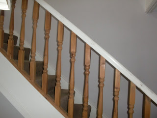


The reason why I have decided to set part of my film in a normal home situation is because it is a drama film. Drama films are sent in everyday situations because they are about everyday life and everyday people.
The home is a very typical home:


When I was planning the run away plot i thought very carefully about what city to use. I considered filming in a place like Devon, however most places in devon are not very busy and i wanted t oget the idea across that he has run away because he wants to be somewhere news where he feel he can blend in. In a big city such as Birmingham it is very easy to do so.

The reason why I have decided to set part of my film in a normal home situation is because it is a drama film. Drama films are sent in everyday situations because they are about everyday life and everyday people.
Monday, 25 October 2010


Tuesday, 19 October 2010
Audience Research (Questionnaire)
Create your free online surveys with SurveyMonkey, the world's leading questionnaire tool.
Monday, 18 October 2010
What is my Target Audience?
When creating my film package (teaser trailer, magazine front cover and film poster) it is very important that i keep my target audience in mind. The reason why i should keep my target audience in mind is because if i don't get it right, the target audience that i am ment to target won't show interest and that will mean i will have no target audience.
My target audience is for family audiences, as this is who is in the film. By the term family film i do not mean, young families with children of 2 or three years of age, I mean teenagers of 15 upwards.
The reason why families with teenage children are my target audience is because these type of people are represented in my film.
Wednesday, 13 October 2010
Drama Film Genre
My film package will be a drama film genre. This genre covers things such as conflict and crime. This is what the jist of my film will be about. I may also have my film genre as a hybrid with a horror film. The reason why i woudl do this is because i may plan for something to happen to the boy when he runs away to another city.
Thursday, 7 October 2010
Final Film Idea
After considering all three options of films that i could create packages for, the best one in my opinion was the last one that i thought of; A boy who runs away because he is a rebellious teenager.
The reason why i have decided to make this film package, using this film idea is because is i think, espically with the teaser trailer because there are many location shots in the particular trailer so therefore with changes of location it will look more appealing to the audience.
The film poster and the film magazine that i create for this film package will also effective, because i can merge images together to show the sence of different locations.
Wednesday, 6 October 2010
Possible Film Ideas
I have thought out three film ideas that i could possibly use when creating my film package.
The first idea is of a boy who is kidnapped:
- The reason why the boy was kidnapped is because his mother and father have split up and the mother won't let the father see his son, so the father kidnaps him.
- In the trailer, the storyline could be shown by key points, such as the mother and father arguing, then him moving out, then he talking to son on the phone, the father and son driving away.
The second idea is that a man kills a women:
- The reason why the man would want to kill the women is because she is his wife and she has had an affair with his brother.
-The trailer could show the man tracking down the women, his wife and then skip to the aftermarth of the brother upset and the husband nervous this wwould leave the audience in suspence weather she has been killed or not.
The third idea is that of a boy who runs away:
- The reason why he could be running away is because he is a rebelious teenager and is annoyed with his parents.
- The trailer could show the mother (or father) and the son arguing about something petty, then it could show the son running away, using public transport to get to a different city away from his family.
Tuesday, 5 October 2010
Drama Genre Example (The Shawshank Redemption)
This is the film trailer for the film; The Shawshank Redemption. This has helped me imensley with the planning of my film package.
Sound in this film trailer is particulary good. While the scene is in court there is a looming sound in the background and ends with the fade down to black. Before this the sound is building up when there are shots of the gun been loaded. When the scene changes to the prision the sound in the background changes again, this time to a dark dim sound. This shows how the prisoners have no hope, or gives the viewer that impression anyway.
Mis-en-scene in this trailer is used very effectivly. Everything that this film trailer has in it is directly connected and fits in. In the court room scene there is paper work and desks, this is typically what you would expect to see in a court room situation.
The editing in this film trailer is very typical of a film trailer. The main cuts used are straight cuts and fades to black to the next scene. The reason why cuts like this are used is to not get the audience confused.
The camerawork used is the same as what they want to use in the film. This main camerashot used are medium shots, the reason for this is because the director wants the audience to see the facial expressions of all the people in the shot.
Change of Film Genre
When i started my research for my film package my inital idea was to make a thriller/horror package. However when i started to research other genres, i thought that my ideas for the film package would not fit into the horror/thriller genre, however there are slight connotations of the genres in my film ideas.
The reason why i decided to chaange my genre is because my film idea where not particularly scarey peices. However i wanted my film to be hard hitting so opted to put my film under the genre of Drama Genre film.
The reason why i decided to chaange my genre is because my film idea where not particularly scarey peices. However i wanted my film to be hard hitting so opted to put my film under the genre of Drama Genre film.
Sunday, 3 October 2010
Thursday, 30 September 2010
Film Trailer, Poster and Magazine (Valkyrie)
I have chosen to look at the film; Valkyrie. I will be anaylising the film trailer, the film poster and the film magazine for this film. The reason why i will be anaylising these three is because i will be creating the same package for my drama film, a poster, a magazine front cover and a trailer.
 The title of the film in this film magazine stands out to the audeince because it is bright blue. Also in the centre of this film magazine is a soilder, and this is what this film is about, so the audience will see this the minuet they look at this magazine front cover.
Film Trailer
The first thing to notice when watching this film trailer is the music that is constantly played in the background. The music that is been played sound like it is leading up to a big event. As the action starts to take place in the trailer the music in the background starts to build up and the sound begins to be very much in the foreground. Half way through the trailer the shots changes from a war zone to a hospital, with this change in the shot the music also changes. The souns to changes to a heartbeat sound. This may give the audience the impression that the people in these particular shots maybe fighting for their lives.
The editing in this trailer is very fitting to the music played. The shots are edited mainly by using a fade to black and then to the nexy shot. Each time this happens the music stops to build up the tension.
Film Poster 
When the audience see this film poster the first thing that will stand out is the use of colour. The poster is largly black and white, however there is a little red in the film poster. The red in the film poster gives the audience the impression death, blood and danger. All these things and connoted with red are in some related to the film, the reason for this is because the film is about the war in Nazi Germany.
The film poster is very simplistic, however it is very effective. The title is in large black text agaist a white background so this will stand out to the audience. The other thing that will stand out to the audience is the main actor who is in the film name; Tom Cruise. The reason why Tom Cruise's name stands out is because it is in white, but the background is red.
Film Magazine
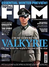 The title of the film in this film magazine stands out to the audeince because it is bright blue. Also in the centre of this film magazine is a soilder, and this is what this film is about, so the audience will see this the minuet they look at this magazine front cover.
There is also other advertising on this magazine front cover for what is inside the magazine, however it does not take the audience's attention away from the film on the front cover.
Apart from the bright blue title the rest of the colours that are used ion this magazine front cover are very dull. The reason why the colours are very dull is because the film is about war, so you get the impression it is a very serious film. If the colours were bright yellows and oranges then you would get the impression that the film would be very happy a cheery.
Tuesday, 28 September 2010
Film Poster (The Exorcist)

This film poster is for the film The Exoricist.
The only two things that you can see in this film poster is the title and and small image underneath. The only text that you can see in this film poster is the film title, the reason for this is because the creators want to keep it as simple as possible. Also with the simple text it makes it very catchy and instantly draws the audiences attention in.
The only colours that are used are Black and White. The reason for this is to keep it as simple as possible, however this is also very effective. The image is of a man with a breif case and looks like a busniess man. This shows that he could be a detective or something like that.
Thursday, 23 September 2010
Film Poster (Shutter Island)

This is the film poster for the film Shutter Island.
The first thing that the audience will see when they look at this film poster is a man that is appearing over an island. This makes the audience want to see the film because the audience get the impression of a derelict island, where misterious things could be occuring.
The red title connotes many things such as guilt, sin, anger and blood. All these connotations of the red title could be connected to what the film is actually about.
Wednesday, 22 September 2010
Film Poster (Sin City)
 This is the film poster for the film Sin City.
The first thing the the audience see is the women in the poster, Jessica Alba. The women is dressed provocatively, this is already indentifying the film for a male audience.
In this film poster because of the way that the women standing and what she is wearing, she is only seen as a sex object. This film poster does generalise women as sex objects and nothing else.
In the second text box it says "Jessica Alba in Nancy", rather that what most posters would say " Jessica Alba as Nancy. This give sthe impression that the actress is not playing the charcter, but living the character. This may also emply that the role of Nancy was made for her.
The title of the film "Sin City" is in red. Red can suggest; Death, danger, love and lust. This suggests that the film will be about all of those things, the photo of the women reinforces this.
Monday, 20 September 2010
Film Magazine Analysis (The Dark Knight)
 This is the film magazine Empire promoting the film The Darak Knight.
The main thing that draws the audience's attention to this magazine front cover is the colour. The colours used are green and pink. These colours represent a joker/clown effect. Also the puff is also green which draws the audience's attention because the Joker is also in green.
The name of the magazine; Empire is in the backgroud of the main subject which is the photo of the joker. The reason why the magazine title is not at the subject of the front cover is becauase name is already established, and also the audience has also been established, unlike with the very first edition of the Empire magazine that was published in july 1989, as shown below.
.jpg) With this magazine front cover the main thing that stands out to the audience is the title. The reason why the makers want the title to stand out is because the magazine is new and they want to establish the magazine.
With this magazine front cover the main thing that stands out to the audience is the title. The reason why the makers want the title to stand out is because the magazine is new and they want to establish the magazine.
Thursday, 16 September 2010
Film Magazine Analysis (The Hulk)

This is a film magazine, promoting the film, The Hulk.
The first thing that the reader will see is the image because is dominates the cover, there is not alot of other information of this cover, so the maker will hope that the protential reader will buy the magazibe because they are drawn into the magazine because they want to watch the film. The only other information that is printed is a small puff, the titles of the magazine and film and the word unleashed.
The word unleashed is in bold capital letters ending in a exclamation mark. The reason why the word is set out like this is because it is connected to the imagine, the person in the image (the hulk) is being unleashed.
The colour used are very simple colours, to attract readers. The main colour that is used on the image is green, the reason for this is because the character in the poster (the hulk) is green and the title is also partly green. The puff that is also on the cover is green, to get the readers attention. The reason why the puff is important is because the content says; " INCREDIBLE! THE WORLD'S FIRST FULLY 3-D COVER!", this is important because its a big step in the film magazine history.
Monday, 13 September 2010
My film Genre
There are many genres that I can choose from, every single film out there has a genre to it. Most film genres are easily identifiable, for example a comedy film that just from looking at it you know its a comedy film is Evan Almighty.

Evan Almighty is obviously a comedy film by just looking at the film poster;
There are many things what make this film poster a comedy film poster.
The first thing that makes this film poster a comedy film poster is the fact that the tropical animals are animated. It makes it look like you are viewing a poster for a cartoon series, Similar to Bugs Bunny.
The second thing that makes thing film poster a comedy film poster is the colours used. The colours are used are bright and cheerful, this will put the viewer in a cheerful mood, so they will know its a comedy film.
 This is a film poster for a horror film. You can tell this is a horror film just by looking at the film poster.
The first thing that makes this horror film is the first thing that the viewer will see which is the head with no eyes or month, this could give viewers a fright because it is abnormal.
The second thing that makes this film poster a horror film poster is the colour that is used . The whole poster is made up of dark dim colours, there is a little bit of red in the poster, but this colour doesn't insinuates joy and happiness, it insinuates sorrow and blood, so the viewer may get the idea that a death will occur.
Altogether with the film poster, magazine front cover and a teaser trailer, i need to decide what genre i decide to use. Having looked a few genres and making the opening to a thriller film for my AS coursework i have decided to use a horror genre.
The reason why i have decided to use a horror/thriller genre is for two reasons. The first reason is that because i used a thriller genre for my AS coursework, i wanted to do something that would be similar but not the same, and a horror film is just that. The second thing is actors, its easier for non professional actors to act in horror trailers, because horror teaser trailers will be more simpler than say a romantic comedy teaser trailer.
Although i did use a triller grenre for my AS coursework i could still use it for my A2 coursework because there is alot to play with in a triller genre.
Friday, 10 September 2010
Film Poster (Fright Night)

This is a film poster for the film Fright Night.
The makers of this film poster have used dim colours, the reason for this is because the title of the film "Fright Night" is ment to sound scary, and the poster echos this.
There is a ghost like figure over the house, this will give the viewer the impression that the house may be haunted.
The house is also very isolated, which gives it a sence of vulerability.
Friday, 2 July 2010
Film Poster (Wanted)

This is a film poster for the 2008 film Wanted. Wanted is directed by Timur Bekmambetov.
This makers of this film poster have only used simple colours, the reason for this is because if there are too many bright colours the viewer will become confused.
This film poster is very catchy because your attention is automatically drawn to the woman in the foreground of the poster. The woman is shown very un-stereotypical in this poster because she is holding a gun.
This film poster also suggests a storyline. The name of the film is Wanted and because the man is pointing the gun at the woman it suggests that the women in the film poster may be wanted.
Thursday, 1 July 2010
Film Poster (Jaws)

This is a film poster for the classic film Jaws.
This film poster is very simple but very effective.
The film poster tells the story of the film in just one page. Basically the story of Jaws is that a shark appearing in the sea and eats people.
The poster leaves a cliff hanger to the viewer because you can see a person swimming at the surface of the water and the viewer will be thinking, will the shark kill the man?
The title of the film Jaws in in a bright red colour, which is the same colour as blood. This gives the viewer the impression that blood will be involved in the film.
Wednesday, 30 June 2010
Film Magazine Analysis (Transformers)
The colour of the both magazine and film title are the same colour, this makes them both stand out equally.
The way the text is give the impression that the film is aimed for younger audiences, because its a bright funky colour. If the colour was black and white you would get the idea that the filn is aimed for older audiences, because text will not draw younger audiences but colour and pictures will.
You know straight away that the film is a science fiction film because there is a robot dominating the cover.
Tuesday, 29 June 2010
Film Magazine Analysis (Paranormal Activity)

This is a front page of a film magazine promoting the film; Paranormal Activity.
Although there is alot of information on this magazine cover the title of the film; Paranormal Activity stand out because the writing is white with a red strip around the edge of each letter which makes the title stand out. The title of the magazine; Entertainment is at the background of the main picture of the two actors in Paranormal Activity. The reason why when you look at the magazine the first title that stands out is Paranormal Activity, this reason for this is because obvisously the magazine is trying to promte the new film.
The title gives the viewer an idea of what the film will be about, paranormal activity. The women in the photo is screaming, this shows that some sort of abnormal (paranormal) activity is taking place.
Monday, 28 June 2010
Film Magazine Analysis (Harry Potter)

This is the front of a film magazine, promoting Harry Potter.
This front cover page for a film magazine is very simplistic. There is no text apart from the magazine title on this page. This reason for this is because the magazine creators have made this image to capture the audience. The image that is used of Harry Potter is very simply and effective. The reason why it is effective is because there is not that many clashes of colours, also Harry Potter is surrounded by lightening that appears to coming out of his finger. So this confirms to the audience that the film will be about magic, although it only gives a clue in what the film could be about, it doesn't actually give the plot away.
Friday, 25 June 2010
Teaser Trailer Anaylsis (500 Days of Summer)

500 Days of Summer is a romantic drama-comedy film from 2009. It is directed by Marc Webb. The teaser trailer for 500 Days of Summer uses Camerawork, Editing, Mise-En-Scene and Sound to attract viewing attention.
Camera Work is used to create effect in 500 Days of Summer. Within the first couple of seconds of the teaser trailer the camera focuses, using a two shot on a couple, who look like they are in a relationship. After this the Camera focuses on the couple's hand in hand, this confirms that they are deeply in love to the viewing audience.
Editing is used to create effect in 500 Days of summer. Throughout the middle to the end of clip most of the shots are edited together so that there is a shot of the woman, then there is a shot of the man and the next shot is usually a shot of the couple together. This is then following by constant reminders of the film name; 500 Days of Summer. When the man is at work, he seems to be day-dreaming, the next shot is of the woman walking in the work place, this gives the viewer the impression that the man is day-dreaming about the woman.
Mise-En-Scene is used to create effect in 500 of Summer. The Mise-En-Scene that is used is very naturalistic. Some of the teaser trailer is set in a workplace, this makes it easier for the audience to relate to because most people will be very familiar with this sort of setting.
Sound is used to create effect in 500 Days of Summer. The sound that is used at the very beginning of the teaser trailer is very cheery, so the audience knows straight away that the films is not going to be a sad gloomy film but that is it going to be a happy film. The voiceover person presents the actors and their roles, the voiceover person also tells a story about the life of the charcters "500 Days of...Passion".
Thursday, 24 June 2010
Teaser Trailer Anaylsis (A Nightmare on Elm Street)
 http://www.youtube.com/watch?v=yB8XYZDu5zs
Above is the teaser trailer for the film "A Nightmare on Elm Street". A Nightmare on Elm Street is a 2010 horror film directed by Samuel Bayer. Camerawork, Editing, Mise-En-Scene and sound is used to create effect in the teaser trailer.
Camerawork is used to create effect in A Nightmare on Em Street. The two main show type that are used are long shots and medium shots. The reason why long shots would be used is because with long shots you can see all the action that is taking place in the scene. Medium shots are used to show expression on the characters faces, the reason why a medium shot would be used in teaser trailers are because you can still see the exact location of the character, this means that the teaser trailers are able to be more catchy, because only one shot is needed to be used.
Editing is used to create effect in A Nightmare on Elm Street. At the very start of the trailer there are three establishing shots before any action takes place, the reason why the creators have edited the trailer together like this is because they want the viewers to get an idea of the setting of the film, before the trailer has properly started. The man who is running away from the car, the shot focus on the man being chased by the car, then shows the man who is running away in a more medium shot. The reason why these shots have been edited together like this is to help the viewer follow the plot.
Mise-En-Scene is used to create effect in A Nightmare on Elm Street. Just from the establishing shots you can tell that the film is going to be set in a sort of war zone, because of the rubble and derelict building. When the trailer moves on to the home, the Mise-En-Scene is very naturalistic because it is trying to represent somebodies home.
Sound is used to create effect in A Nightmare on Elm Street. Towards the middle of the teaser trailer when the women is dreaming the sounds she hears are sounds of children, the reason why horror films use children is because the are more vulnerable like the elderly rather adults who are not so vulnerable. At the start of the trailer the action sound does not start until we see the man appear who is running away from the car, this will build up the tension for the viewer because the sound becomes for forceful.
Wednesday, 23 June 2010
Teaser Trailer Anaylsis (Terminator Salvation)

http://www.youtube.com/watch?v=VYc3vOmof_8
Terminator Salvation is a Science Fiction film, that is American. The film is directed by McG, one of the writers for the film include Jame Cameron.
Terminator Salvation uses teaser trailers with the use of Camera Work, Editing, Mise-En-Scene and Sound to create a catchy teaser trailer that will attract the audience.
With the Camera Work the camera always focuses alway on the main bit of the action in the shot. One of the camera shots that is used is an over the shoulder shot, the reason why this shot is used is because the creators wan the viewer to see and feel extactly how the charcter is feeling and you also can see what the character is seeing. 
The editing in the teaser trailer is used for great effect. Throughout the whole of the teaser trailer is very fast, this automatically builds up the tension for the viewers because it shows that the scenes are very full of action. Also the editing is used to full effect because in between each scene the editing used is like a flash on the VCR recorders. The reason why something like this may of been used is because the film "Terminator Salvation" is set in the future (2018) so it is almost like on contrast because VCR's are history and this film is the future.
The Mise-En-Scene that is used in the teaser trailer will give you an idea of what the film is about because the teaser trailer is simply parts of the film edited together. So therefore the Mise-En-Scene will give the idea of the film away.
The final aspect that is used in the teaser trailer is Sound. In any teaser trailer sound is very important, although dialogue is not always used in teaser trailers, sound is normally non-diegetic to add effect. In Terminator Salvation the sound is used to build up to the action with the editing. In this particular teaser trailer dialogue is used, this only dialogue is in fact a voice over, the voice over is telling the story, giving ideas about what might happen in the film.
Tuesday, 22 June 2010
My final Piece
After looking at all the options i am able to short list my options, the two options that i will decide between are:
1. A promotion package for a new soap opera
2. A promotion package for the release of a new film
I need to look at both of these options in furthur detail, in order to make a final decision.
With a soap opera I would have to decide of what type of audience i want to target. For example with the soap "Eastenders" the target audience is mainly younger people, the reason why this is, is because the a huge population of cast are young to middle aged actors. Also the setting of the soap is in a very lively area. If you compare "Eastenders" to the soap "Coronation Street" it is completely different. "Coronation Street " has a more broader audience because it is a even match between young to middle aged characters and more mature respectable adults.
With a new film i would also have to consider my target audience and the genre that i would want the film to be. If you think about horror films, the target audience for these type of films are younger to middle aged people, very few older people will watch horror films. If you compare horror films to comedy films you will find that more older people will want to watch comedy films than younger people.
Overall after analysing both of my preferred options i think that the best option for me is to do a promotion package for a new film. The reason why i chose this is because with a film package you have the options to be more creative rather than a soap opera. With a film package there is more options for me to put my own stamp on it, as it is easier to challenge the conventions in a film than a soap opera.
Monday, 21 June 2010
Project Options
There are different options for me to consider when organising my A2 media coursework;
1. A promotion package for the release of ab album, to include a music promo video, together with two of the following three options:
- a website homepage for the brand
- a cover for its release as part of a digipal
- a magazine advertisment for the digipack
2. A promotion package for a new film, to include a teaser trailer, together with two of the followingthree options:
- a website homepage for the film
- a film magazinefront cover featuring the film
- a poster for the film
3. An Advertising package for a new producy ot service, to include two TV adverts, together with two of the following three options:
- a radio advertisment
- a TV programme sponsership
- a web pop-up
4. A promtion package for a new soap opera, to include a TV trailer, together with two of the following three options:
- a listings magazine front cover featuring the new soap
- two hyperlinked webpages (with video extract) for the soap's website
- a poster f0r the soap
5. A selection of materials related to an orginal children's TV drama, to include the title sequence to the TV programme, together with two of the following three options:
-the front cover to a magazine for the series
- a DVD cover for the series
- a radio advertisement for the magazine
6. An extract for a new documentry TV programme, lasting approximately five minutes, together with two of the following three options:
- a radio trailer for the documentry
- a double-page spread from a listings magazine focused of the documentry
- a film magazine review page featuring the film
7. An extract/package form a local TV news programme, lasting approximately five minuets, together with two of the following three options:
- two hyperlinked pages from the programme's website
- a generic radio trailer for the programme
- a short title sequence for the programme
I should looked through all of these options in detail to make sure that i make the right decision for my project. The option that I pick has to draw particular attention to me because i do not want to pick something that does not appeal to myself.
Subscribe to:
Comments (Atom)